CHALLENGE
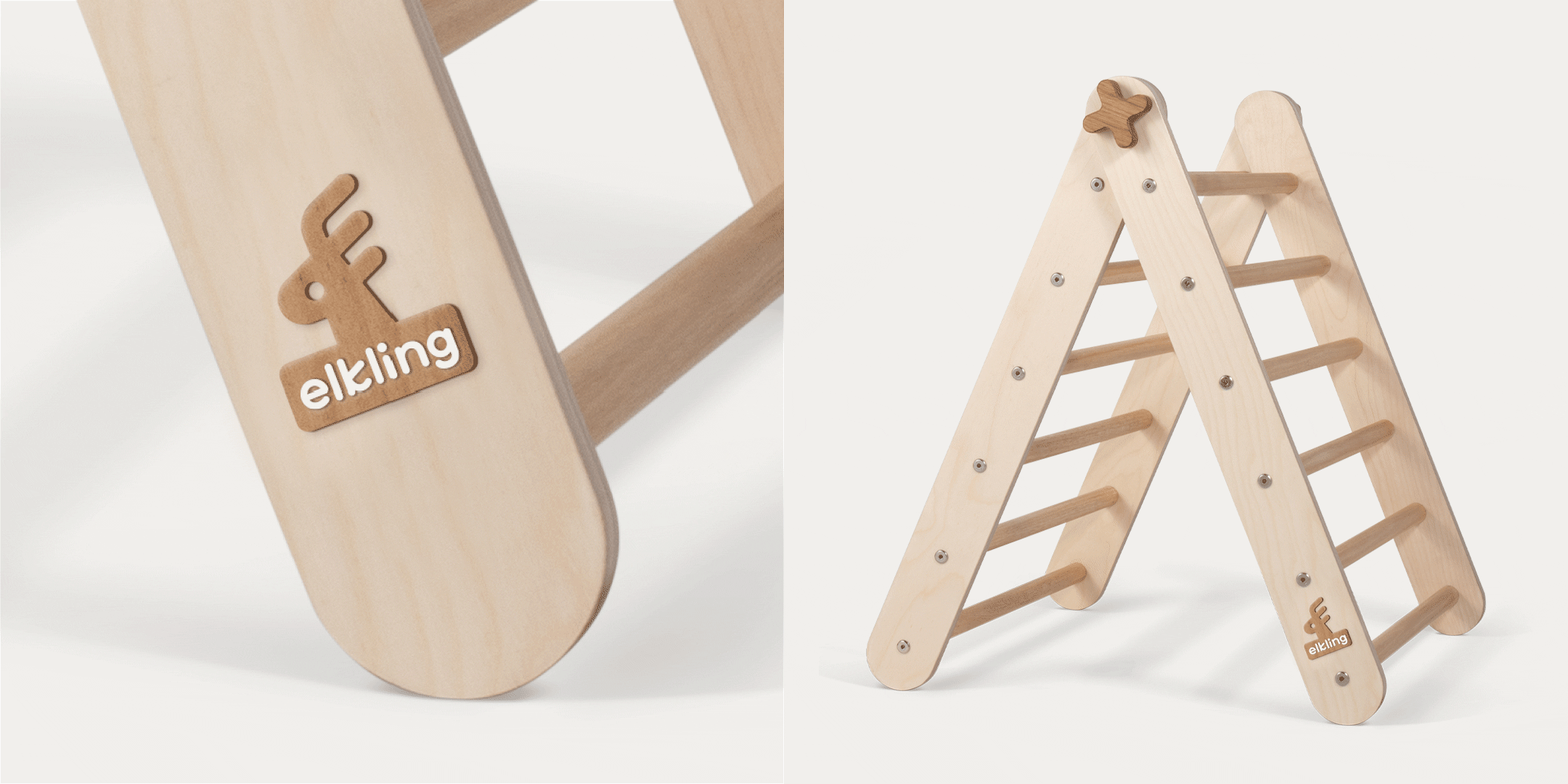
Much like the Steiner philosophy of facilitating creative, self-directed play in a natural environment – this new Direct-To-Consumer (DTC) brand of play equipment and toys has been built on the idea of providing toys that encourage initiative, imagination and physical development in children. They are made with natural, sustainable materials and are beautifully simple in their design so as not to dictate play. Instead, they encourage all sorts of possibilities for children to experiment and play in their own way and stretch their imagination and coordination. The challenge was to create a brand to work with the simplicity of the product design while introducing a unique and playful name and visual language for the brand.
THINKING
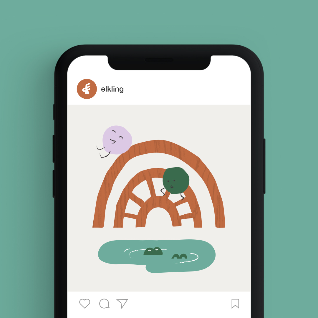
Part Elk, part älskling (Swedish for darling), the Elkling name suggests a young, curious and playful brand, but at the same time taking cues from the Scandinavian product design aesthetic. The brand icon represents a baby Elk (the Elkling) with antlers taking form of an E, paired with an equally as friendly custom curved word mark. A hand crafted, freely drawn, illustrative style, helps to visually articulate the essence of the the brand, to open imagination through play.


TOUCHPOINTS
Brand Strategy + Brand Naming + Brand Positioning + Brand Story + Visual Identity + Shopify E-Commerce Website Design + Digital Design
