CHALLENGE
Creators of the worldwide toy phenomenon Shopkins wanted to ‘grow up’ their master brand Moose. They needed it to reflect their ‘serious player’ status… without making them feel like a ‘serious grown up’.
THINKING
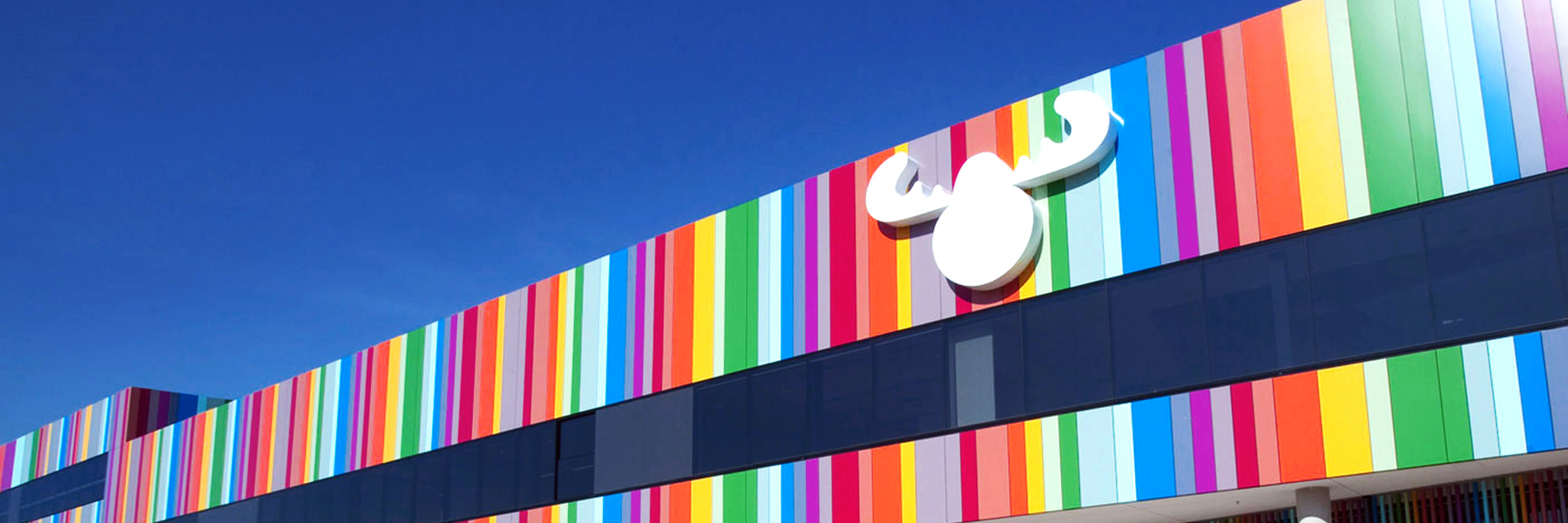
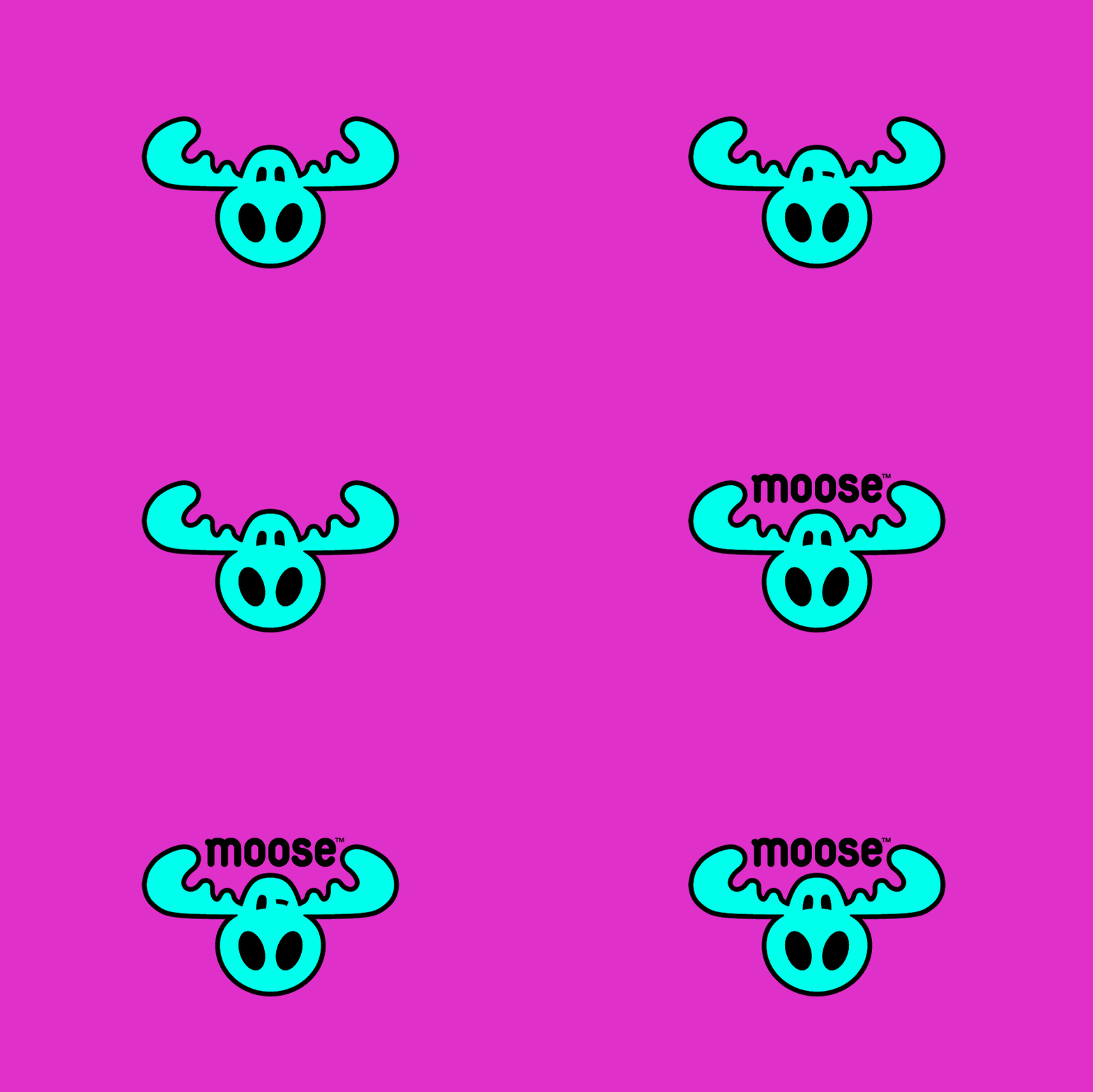
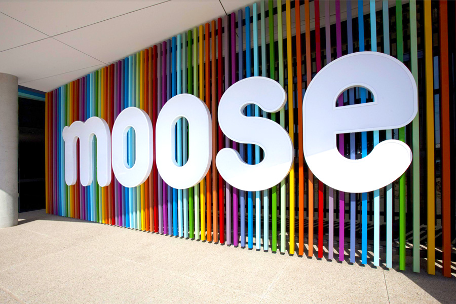
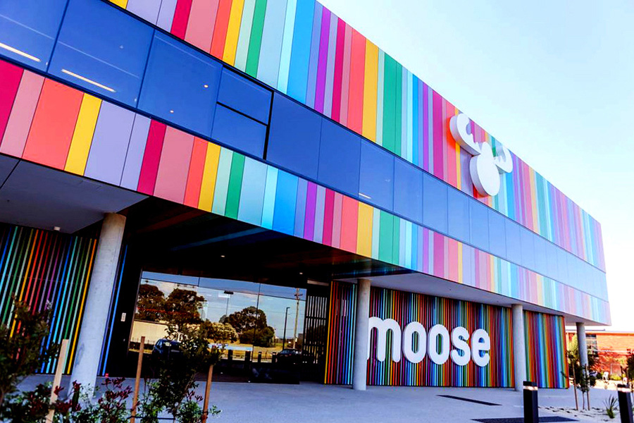
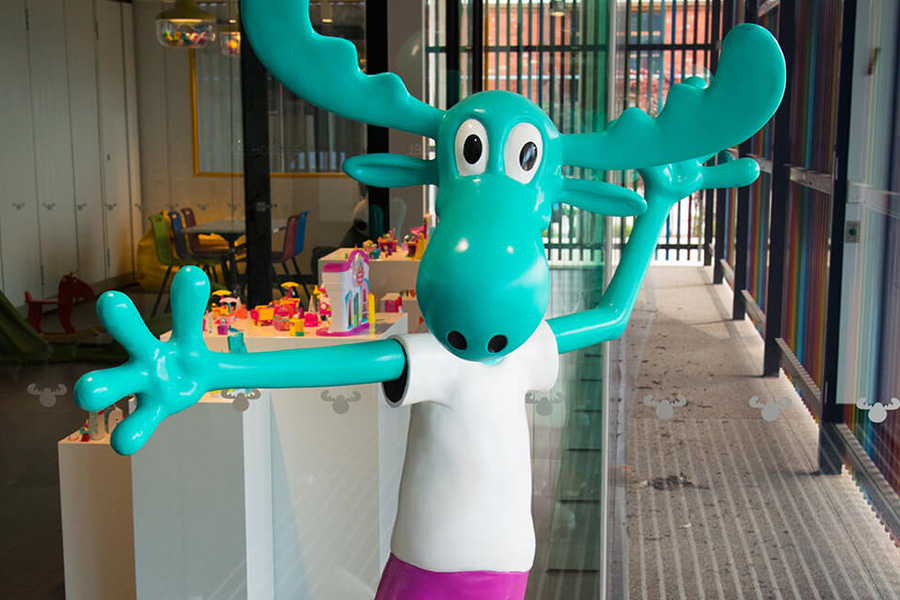
With a strategy focused on making kids ridiculously happy, we wanted to project a strength and confidence in the master brand that empowered rather than overshadowed the unique identities and stories of each of Mooses’ sub-brands (toy ranges). We created parred back mark to let the visual language around it be any and every colour of the rainbow. We retained the existing equity of the teal and using a moose in the mark, but we wanted brutal simplicity while still retaining some ridiculous fun. We took the cartoon style out of Mr Moose to create more of a brand mark and less of an illustration. The aim was to create something so iconic that even as a simple silhouette, the Moose mark would be strong enough to to hold its own alongside the likes of Hasbro, Lego and Disney in major retailers across the globe.


IMPACT
With a simple truth about making kids happy and valuing ‘THE WOW’, Moose have achieved crystal clear clarity on who they are. There’s a deeply understood vision at Moose; everyone involved in the brand embraces it and everything about Moose has been ‘moosified’ accordingly. Happy moosers, happy kids, happy days.
Brand Strategy + Brand Mark + Visual Language
